Aerow
Aerow
Making travel pleasant for everyone.
Wayfinding kiosk for Toronto Pearson International Airport
Aerow
Aerow
Making travel pleasant for everyone.
Wayfinding kiosk for Toronto Pearson International Airport

Table of Content
Table of Content
My Role
UX Designer
Overview
Aerow is a digital twin solution that allows passengers to scan boarding passes or enter details to access flight information. Integrating Toronto Pearson's digital maps and kiosks, it suggests optimal routes to gates and nearby amenities.
Aerow is a digital twin solution that allows passengers to scan boarding passes or enter details to access flight information. Integrating Toronto Pearson's digital maps and kiosks, it suggests optimal routes to gates and nearby amenities.
Timeline
12 weeks (January 2023 - April 2023)
12 weeks (January 2023 - April 2023)
Team
3 Developers, 2 Designers, 1 Project Manager
3 Developers, 2 Designers, 1 Project Manager
The Problem
In 2022, 76% of travellers were stressed out travelling through the Toronto Pearson Airport.
In 2022, 76% of travellers were stressed out travelling through the Toronto Pearson Airport.
In the same year, Toronto Pearson earned the unenviable distinction of being ranked as the world's worst airport. Countless travellers encountered a multitude of issues while navigating this airport, ranging from security checkpoints, flight delays and cancellations, luggage woes, way-finding challenges, limited information availability, to time constraints, and more.
The question that arises is: Why do travellers consistently endure such negative experiences at Toronto Pearson Airport?
Solution
Having clarity is key
Having clarity is key
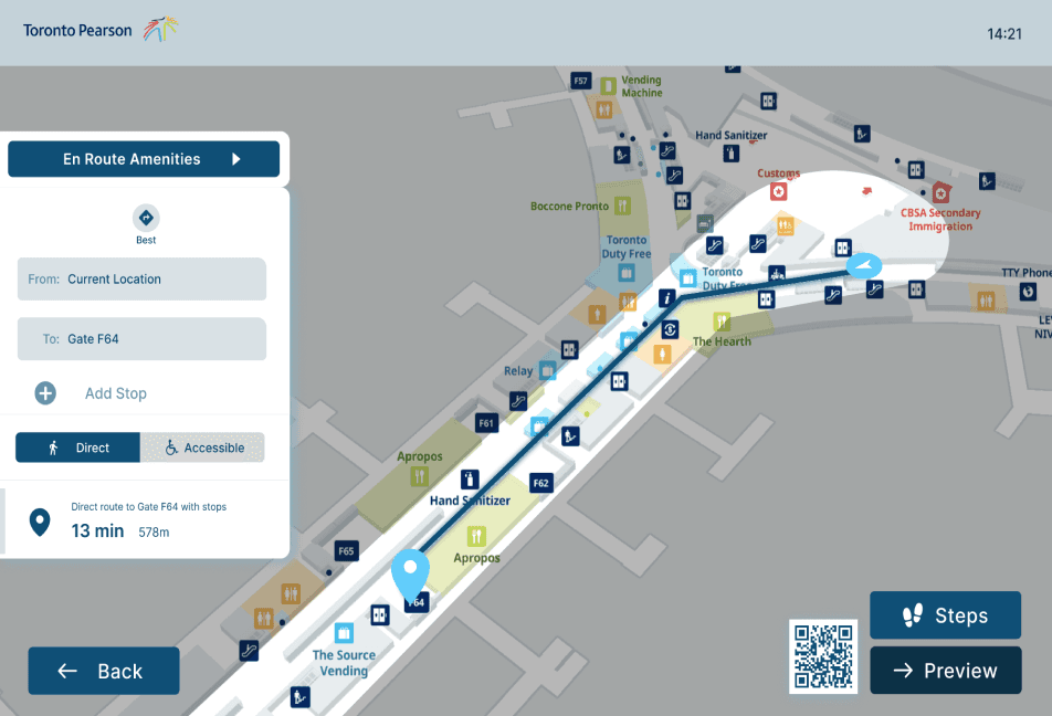
providing optimal routes to destination
allows travellers to navigate easily
lowers the chances of getting lost
providing optimal routes to destination
allows travellers to navigate easily
lowers the chances of getting lost


Real-time updates
Real-time updates
travellers are able to know immediately if there are delays
allows travellers to plan around their boarding time
informs travellers the busyness of areas/lineups
travellers are able to know immediately if there are delays
allows travellers to plan around their boarding time
informs travellers the busyness of areas/lineups


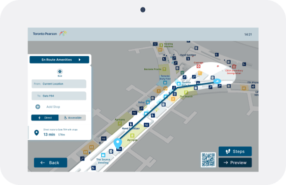
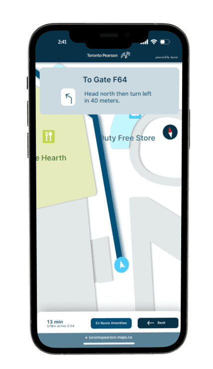
Allowing travellers to navigate with cellular device
Allowing travellers to navigate with cellular device
travellers can easily follow along
travellers can get notified about delays and boarding times
travellers can easily follow along
travellers can get notified about delays and boarding times

Research
Travellers often experience high levels of stress during their journeys, particularly when navigating unfamiliar airports. To gain a better understanding of these challenges, I conducted interviews with individuals who recently traveled through Toronto Pearson International Airport.
Travellers often experience high levels of stress during their journeys, particularly when navigating unfamiliar airports. To gain a better understanding of these challenges, I conducted interviews with individuals who recently traveled through Toronto Pearson International Airport.
“Everytime I go to Toronto Pearson, I just get very lost. There are barely any signages and the airport is often busy so it gets frustrating to get through.”
“Everytime I go to Toronto Pearson, I just get very lost. There are barely any signages and the airport is often busy so it gets frustrating to get through.”
Offering travellers clearer insights and easily accessible flight information has the potential to save a significant
amount of time and reduces frustration.
Offering travellers clearer insights and easily accessible flight information has the potential to save a significant
amount of time and reduces frustration.
The Gap
Currently, Toronto Pearson Airport utilizes analog signage, an online interactive map, flight information screens, and various other resources to assist travellers during their journey through the airport. However, these tools often fall short of their potential, resulting in a disconnect between travellers and these valuable resources.
Numerous gaps contribute to traveller’s frustration. Including issues such as insufficient and confusing signage, a lack of real-time updates on flight information, gate changes, delays, overcrowded areas, and inadequate accessibility.
Numerous gaps contribute to traveller’s frustration. Including issues such as insufficient and confusing signage, a lack of real-time updates on flight information, gate changes, delays, overcrowded areas, and inadequate accessibility.
Numerous gaps contribute to traveller’s frustration. Including issues such as insufficient and confusing signage, a lack of real-time updates on flight information, gate changes, delays, overcrowded areas, and inadequate accessibility.
User Interviews
My interviewees indicated that they would be way less stressed out if there are more clarity in signages and if they are able to have real time flight updates immediately. I’ve conducted interviews with 6 individuals who have recently travelled to Toronto Pearson. I’ve asked them some questions to discover trends on what they struggle with during the time at the airport. Once I collected the data, I organized them through affinity mapping.
Research Questions:
1. What was the most difficult part about travelling through Toronto Pearson? why?
What do you think that could help your experience at the airport more seamless? Why?
What was experience like when you had to get to your flight?
What was the process like going to your designated gate?
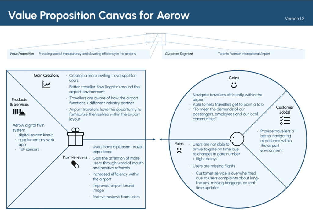
Valie Proposition Map
We wanted to test our initial assumptions and secondary research findings in the real world to establish a solid model for our system. Plus, we could validate users’ pain and gain points for our airport way-finding system.
Based on our initial Value Proposition Map, we will validate the customer’s pain and gain points, and develop our product prototype. We decided to make preliminary observations to properly identify areas of need within the locale of the airport to better implement our journey map prototype. We also sent out surveys to gather valid information about frequent Pearson traveler's' pain points and needs.


Main Insights
Throughout my interviews, a common theme emerged – travellers consistently struggle with airport navigation and accessing timely flight information. This recurring frustration emphasizes a significant pain point in the travel experience. It's clear that there's a need to improve current way-finding solutions and real-time flight updates. These improvements have the potential to elevate user satisfaction and alleviate the stress within the navigating experience.
Throughout my interviews, a common theme emerged – travellers consistently struggle with airport navigation and accessing timely flight information. This recurring frustration emphasizes a significant pain point in the travel experience. It's clear that there's a need to improve current way-finding solutions and real-time flight updates. These improvements have the potential to elevate user satisfaction and alleviate the stress within the navigating experience.
How might we provide spatial transparency to elevate efficiency for all travellers within airport environment?
How might we provide spatial transparency to elevate efficiency for all travellers within airport environment?
Ideating
A big element to focus on is way-finding throughout Toronto Pearson Airport. Currently, there are no in-depth instructions or information to inform the exact route and the duration to direct passengers to their desired destination within the airport. Potential technologies and devices that will enable this solution include a 5G network for the smartphone application, the Internet of Things, and AI to predict wait time, analyze any abandoned items, and navigate the space in a smarter way.
To help combat the negative experience of long lines up, flight disruptions, miscommunication from airport employees, and missing baggage. Our digital twin system will focus on the exact mapping of Toronto Pearson Airport and real-time traffic and delays. It is like Google Maps for airport navigation, specifically for Toronto Pearson Airport.
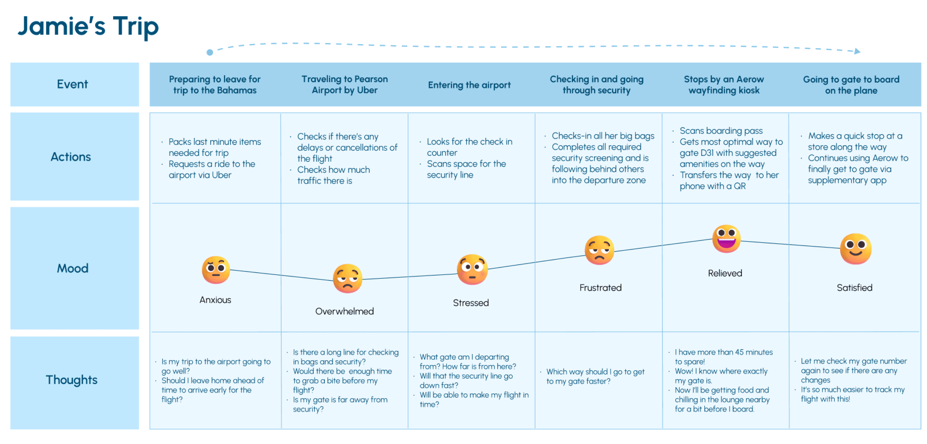
Our team created a value proposition canvas and user journey map to ensure we are positioned around the users’ values and needs.
User Journey Map


Design
3 Major Improvements in the Design
After conducting two usability tests, we collected valuable feedback from our peers. Over the course of four weeks,
our team diligently worked on iterating the design, implementing three significant improvements.
After conducting two usability tests, we collected valuable feedback from our peers. Over the course of four weeks,
our team diligently worked on iterating the design, implementing three significant improvements.
big kiosk > standing kiosks
made the strategic decision to transition from designing for large kiosks to compact standing kiosks
choice was informed by the greater prevalence and cost-effectiveness of standing kiosks in airport settings
during our usability tests, many participants expressed concerns about privacy when using QR codes
Colour
decided to incorporate a diverse range of blues to enhance the prototype’s aesthetic
decided to incorporate a diverse range of blues to enhance the prototype’s aesthetic
Allows travellers to navigate the functions better
designed pages with a limited number of options to ensure simplicity and avoid overwhelming the user
designed pages with a limited number of options to ensure simplicity and avoid overwhelming the user


Testing
Setback & New Direction
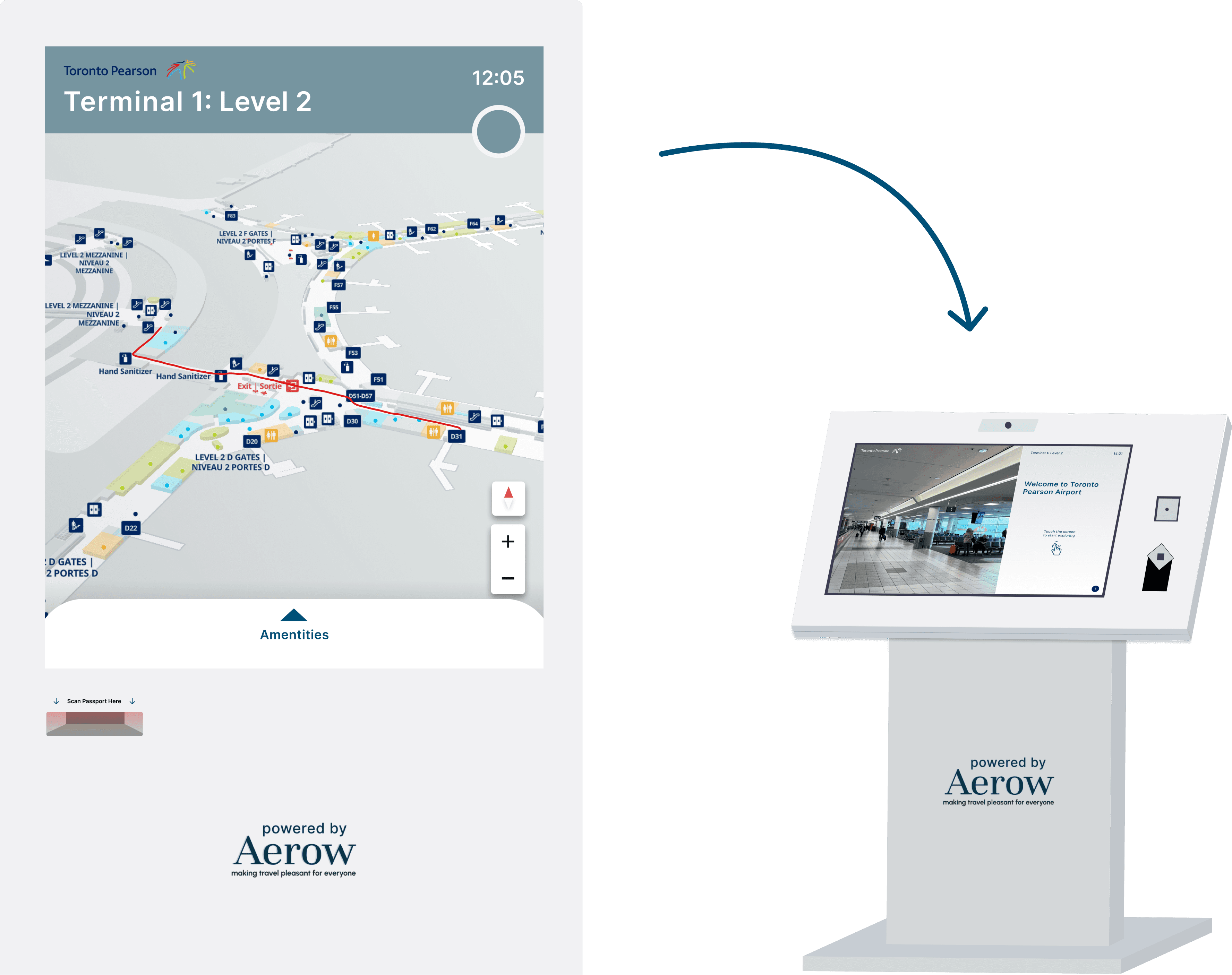
Our team’s initial idea was to develop a mobile app aimed at assisting travellers. However, we recognized that requiring travellers to download an app could be inefficient. We found that the airport has a lot of standing kiosks. So, we shifted our approach and decided to leverage the existing technology infrastructure at airports while simultaneously creating a web application for seamless and convenient access.
Our team’s initial idea was to develop a mobile app aimed at assisting travellers. However, we recognized that requiring travellers to download an app could be inefficient. We found that the airport has a lot of standing kiosks. So, we shifted our approach and decided to leverage the existing technology infrastructure at airports while simultaneously creating a web application for seamless and convenient access.
Testing Screens
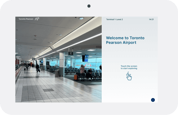
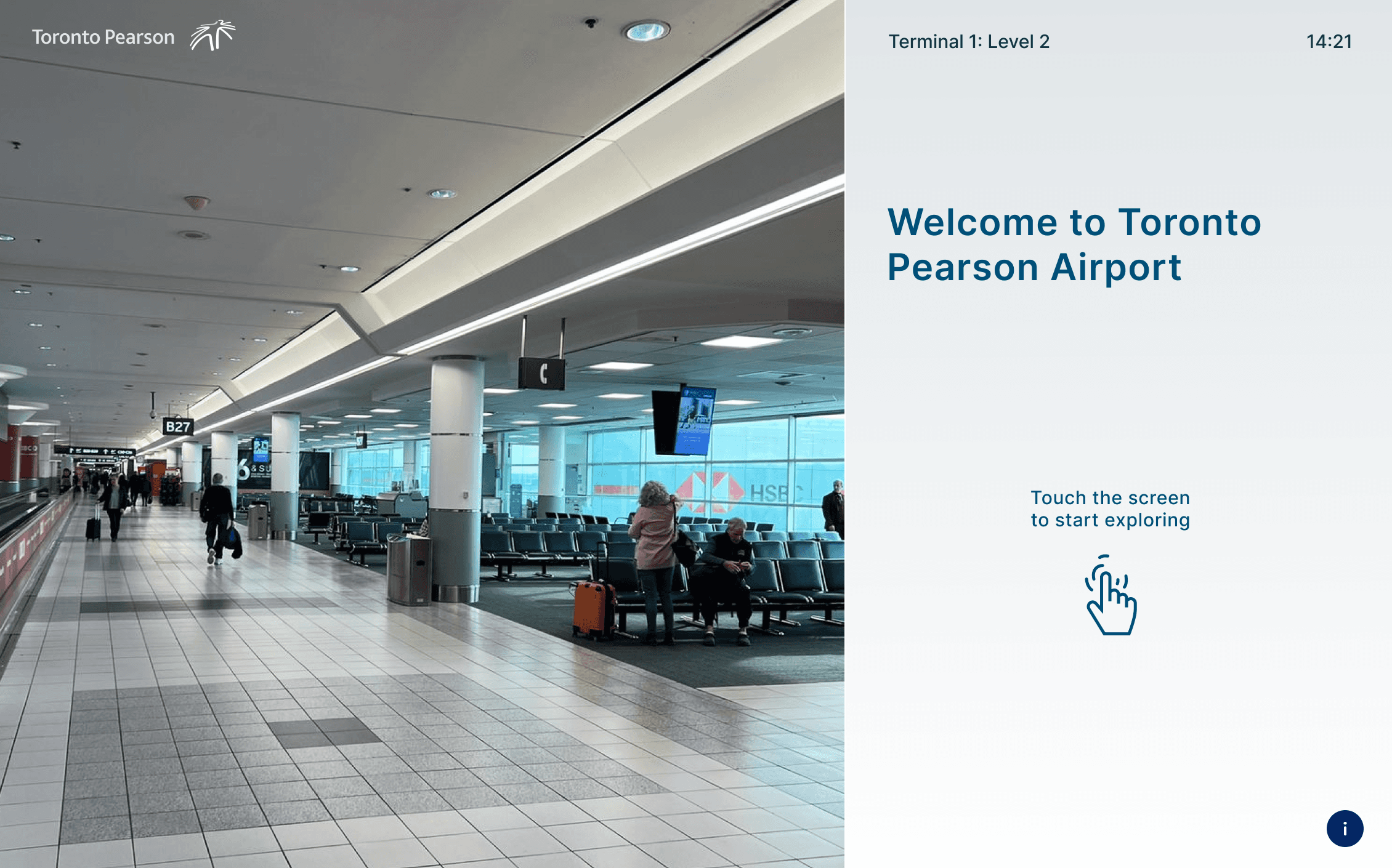
Welcome Page
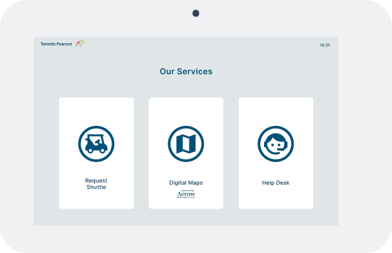
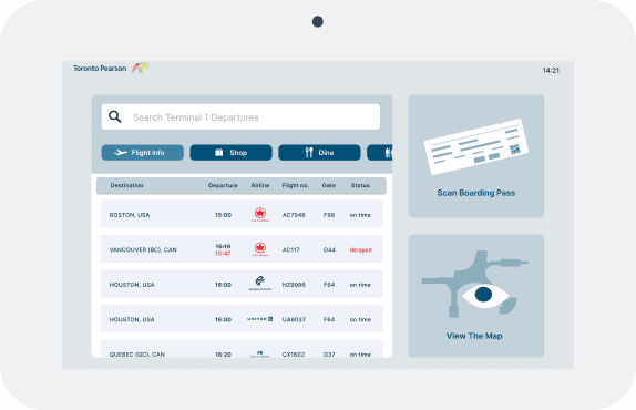
Service Page

Real-time flight updates

Directions to locations within airport
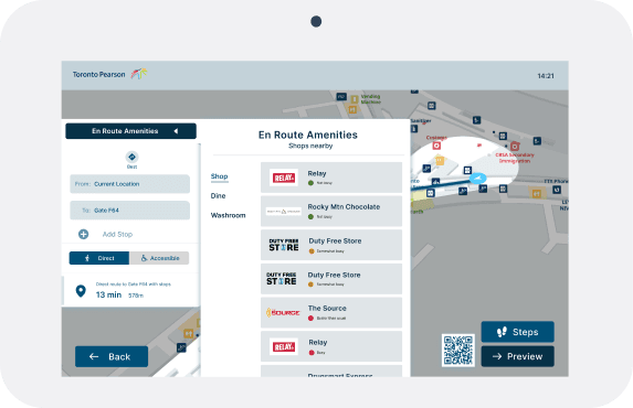
Live updates of amenities
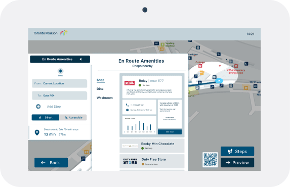
Busyness & other updates of amenities
Prototype
View live updates of your flight & have information sent to your phone
Navigate to any amenities within the airport with ease
Reflection & Takeaway
Having Experience With the Problem First Hand
It was extremely valuable as it provided us with a deep understanding of the challenges and pain points our users face. It enabled us to approach the problem from a more empathetic and insightful perspective.
Avoiding Hastiness in the Design Process
Due to our tight schedule, some decisions were made in a hurry. It made me realized that it's crucial to make a more deliberate approach to the design process. Given more time, this approach would enable us to create more thoughtful solutions to the problems we encountered while designing.
Strive for Iteration at Every Stage of the Process
Again, due to our restricted timeline, we didn’t have the opportunity to test as often as we wanted to. However, this project taught me that iterating as much as possible throughout the project allows us to refine and enhance our work systematically. It also empowers us to make incremental improvements, respond to user feedback, and ensure that the end product aligns closely with user needs and project objectives.
Emphasize the Integration of Accessibility from the Start
While we initially designed the prototype for the large kiosk screen, it wasn't until after our first usability test that we recognized its inaccessibility. In the future, I need to ensure that I incorporate accessibility into my design approach.

Created by Ophelia Chung